筑紫ゴシック L
筑紫ゴシック L
フォントについて
対応サービス
デザイナー

藤田 重信
Fontworks
詳細
- 読み方
- つくしごしっく
- フォントメーカー
- Fontworks
- ファウンダリー
- フォントワークス
- 言語:
- 日本語
- カテゴリ
- ゴシック系
- 規格
- JIS X 0213:2000
- 文字セット
- 詳しくはこちら
- ファイルサイズ
- 5MB
- OpenType機能
- 字幅半角メトリクス(halt)
- カーニング(kern)
- プロポーショナルメトリクス(palt)
- 縦組み字幅半角メトリクス(vhal)
- 縦組みペアカーニング(vkrn)
- 縦組みプロポーショナルメトリクス(vpal)
- 字体組版/分解(ccmp)
- 任意の合字(dlig)
- 分数(frac)
- 等幅全角字形(fwid)
- 横組み用かな(hkna)
- 等幅半角字形(hwid)
- イタリック(ital)
- JIS2004 字形(jp04)
- JIS78 字形(jp78)
- JIS83 字形(jp83)
- 一般的な合字/標準合字(liga)
- 修飾字形(nalt)
- 印刷標準字体(nlck)
- プロポーショナルかな(pkna)
- プロポーショナル字形(pwid)
- 等幅四分字形(qwid)
- ルビ用字形(ruby)
- 下付き文字(subs)
- 上付き文字(sups)
- 旧字体(trad)
- 等幅三分字形(twid)
- 縦組み用字形(vert)
- 縦組み用かな(vkna)
字形
{{ currentShapeTextTitle }}
- {{ text }}
フォントファミリー8スタイル
{{ currentSampleTextTitle }}
- 筑紫ゴシック L
- {{ currentSampleText }}
- 筑紫ゴシック R
- {{ currentSampleText }}
- 筑紫ゴシック M
- {{ currentSampleText }}
- 筑紫ゴシック D
- {{ currentSampleText }}
- 筑紫ゴシック B
- {{ currentSampleText }}
- 筑紫ゴシック E
- {{ currentSampleText }}
- 筑紫ゴシック H
- {{ currentSampleText }}
- 筑紫ゴシック U
- {{ currentSampleText }}
- 一般的な合字/標準合字(liga)
- 前後関係に依存する字形(calt)
- 任意の合字(dlig)
- スモールキャップス(smcp)
- 大文字のスモールキャップス(c2sc)
- スワッシュ字形(swsh)
- デザインのバリエーション(salt)
- ライニング数字(lnum)
- オールドスタイル数字(onum)
- プロポーショナル数字(pnum)
- 等幅数字(tnum)
- 分数(frac)
- 上付き序数表記(ordn)
- デザインのセット 01-20(ss##)
- プロポーショナル字形(pwid)
- プロポーショナルメトリクス(palt)
- プロポーショナルかな(pkna)
- 等幅全角字形(fwid)
- 等幅半角字形(hwid)
- 字幅半角メトリクス(halt)
- 等幅三分字形(twid)
- 等幅四分字形(qwid)
- JIS78 字形(jp78)
- JIS83 字形(jp83)
- JIS90 字形(jp90)
- JIS2004 字形(jp04)
- 旧字体(trad)
- ルビ用字形(ruby)
- 横組み用かな(hkna)
- 印刷標準字体(nlck)
- 修飾字形(nalt)
- イタリック(ital)
- 縦組みペアカーニング(vkrn)
- 縦組み用字形(vert)
- 縦組みプロポーショナルメトリクス(vpal)
- 縦組み字幅半角メトリクス(vhal)
- 縦組み用かな(vkna)
- カーニング(kern)
- 字体組版/分解(ccmp)
- ローカライズの字形(locl)
- 上付き文字(sups)
- 下付き文字(subs)
-
.png)
DYSCHRONIA: Chronos Alternate
UD角ゴ_スモールM、筑紫ゴシックM、筑紫アンティークL明朝
©Project DYSCHRONIA.
-
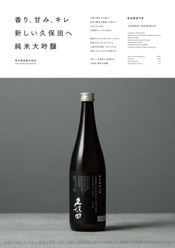
朝日酒造株式会社
筑紫明朝 / 筑紫ゴシック
朝日酒造株式会社
-

サカナトエール
筑紫ゴシック
-
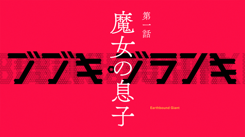
ブブキ・ブランキ
筑紫アンティーク明朝/筑紫ゴシック/UD角ゴ_ラージ
© Quadrangle / BBKBRNK Partners
-

ハピネスチャージプリキュア!
学参丸ゴ/筑紫ゴシック/ハミング
©ABC・東映アニメーション
-
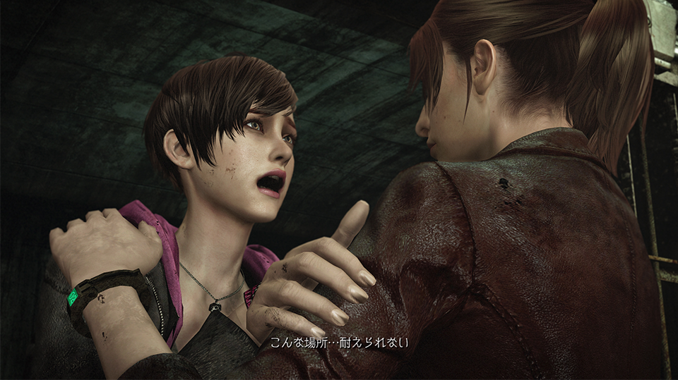
バイオハザード リベレーションズ2
ニューシネマ/筑紫明朝/筑紫オールド明朝/筑紫ゴシック/ロダン/アニト
©CAPCOM CO., LTD. 2015 ALL RIGHTS RESERVED.
-
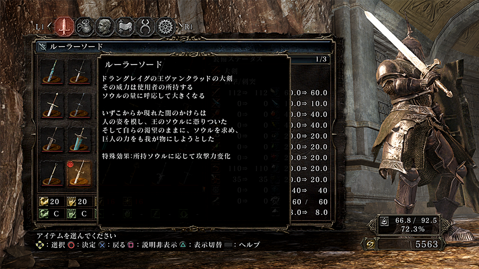
DARK SOULS II
マティス/筑紫明朝/筑紫オールド明朝/筑紫ゴシック
©2015 BANDAI NAMCO Entertainment Inc. / ©2011-2015 FromSoftware, Inc.
-

三国志ロワイヤル
豊隷/筑紫ゴシック
©DeNA Co.,Ltd. All rights reserved.
-

忘れる力: 「すっきり」「はっきり」「ゆったり」
筑紫明朝/筑紫ゴシック/筑紫アンティーク明朝
機能詳細
{{ functionType === 'spec' ? '文字セット' : 'OpenType機能' }}
| OTF | TTF | ||||||||
|---|---|---|---|---|---|---|---|---|---|
| A-J 1-6 | A-J 1-5 | A-J 1-4 | A-J 1-3 | ||||||
| Pr6 | Pr6N | Pr5 | Pr5N | Pro | ProN | Std | StdN | ||
| L | ● | ● | ● | ● | |||||
| R | ● | ● | ● | ● | |||||
| M | ● | ● | ● | ● | |||||
| D | ● | ● | ● | ● | |||||
| B | ● | ● | |||||||
| E | ● | ● | |||||||
| H | ● | ● | |||||||
| U | ● | ● | |||||||
合字
文字
数値
デザインのセット
幅の異なる字形
文化的に異なる字形
縦書き機能
その他
対応サービス
使用事例
関連記事


© 2026 Monotype KK